Client
How can the Flixster App UI be improved for its users?
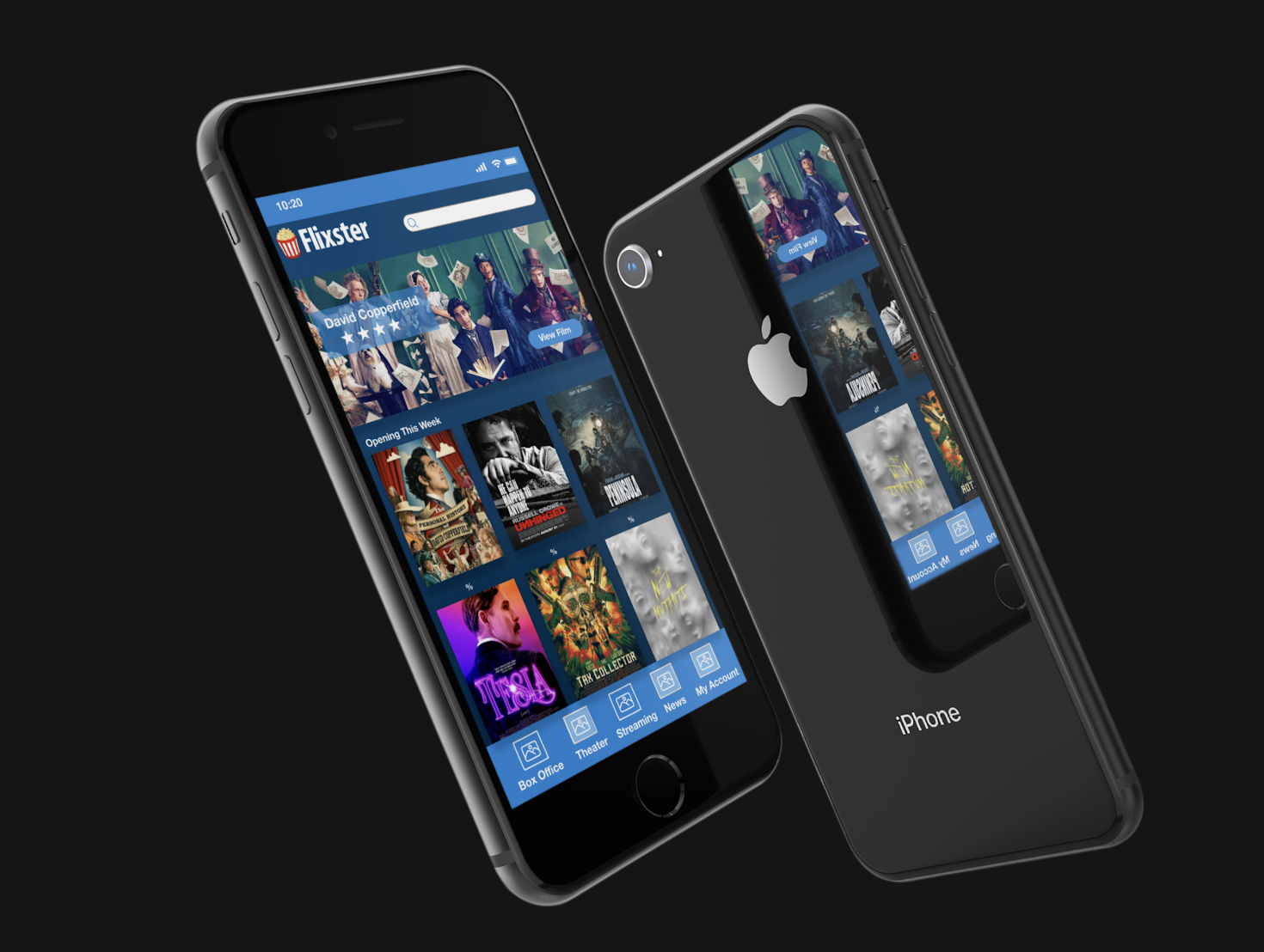
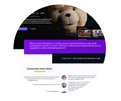
Flixster is a movie application and site in partnership with Fandango. It reveals when the latest movies hit theaters, provides location, movie trailers, and fun facts on selected films. It can also let audiences know if their favorite movies are on Fandango Now or other popular streaming services.
Project Goals:
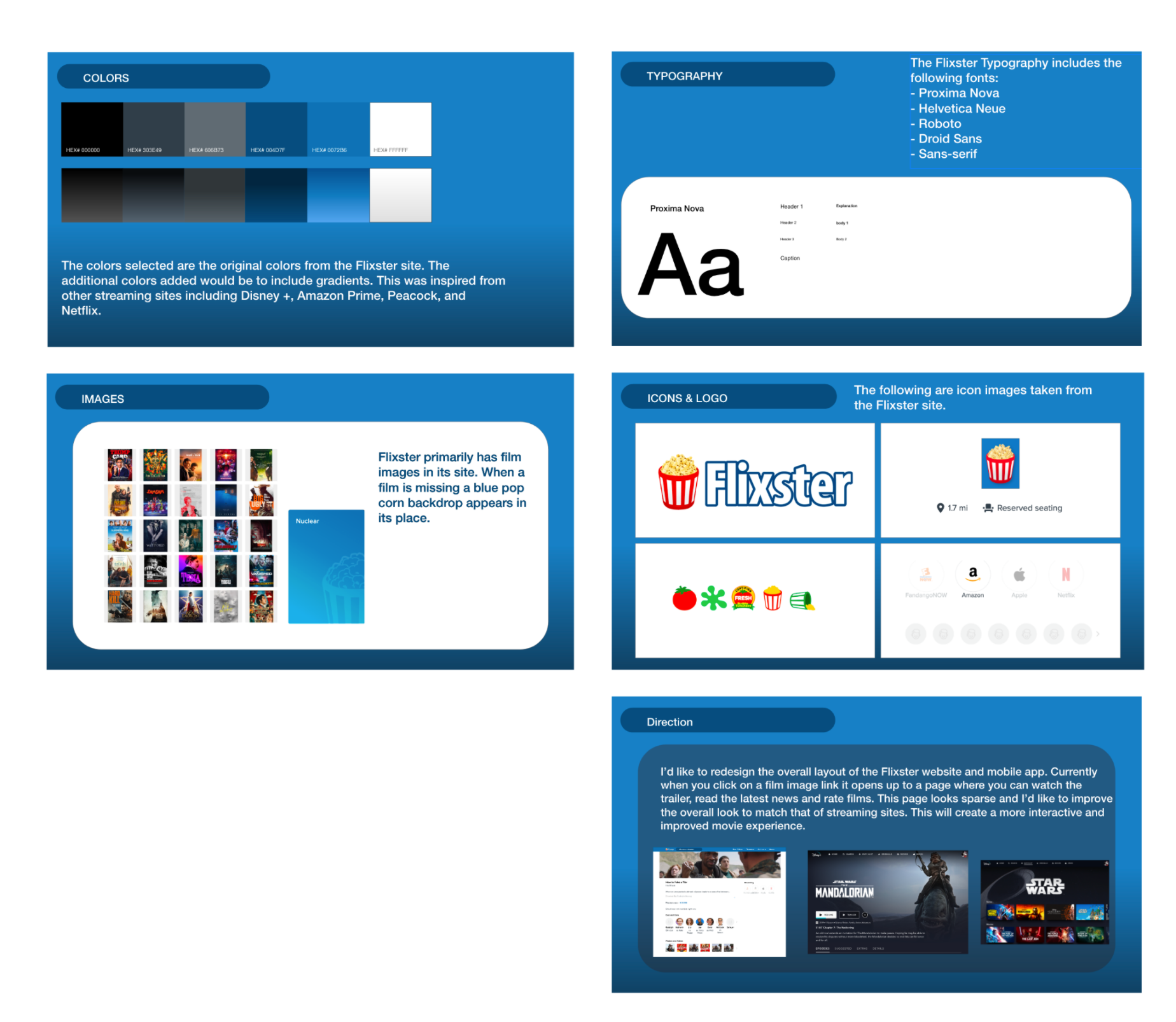
- Research the brand and develop a new style guide.
- Work with a team to create a card sort on what is currently working and not working on the site.
- Create a wireframe and high-fidelity prototype.
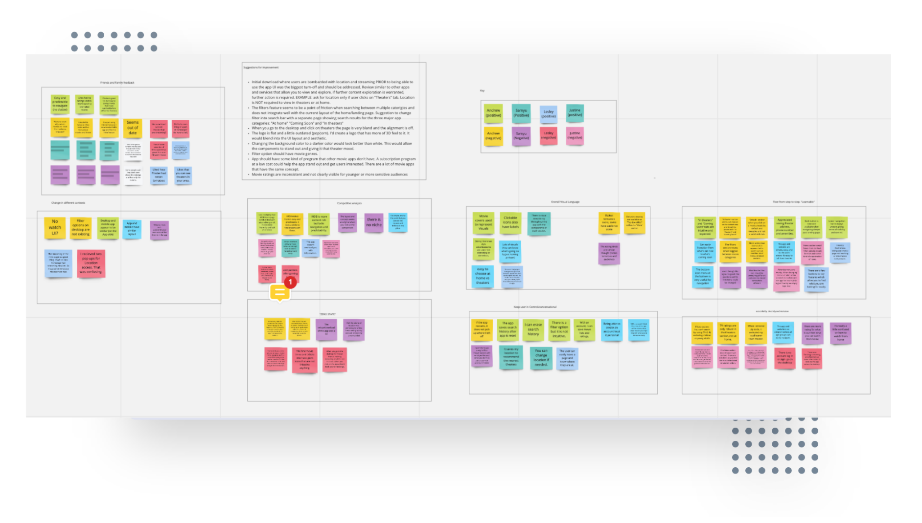
User Research
Discovery:
The project began by researching Flixster’s style guide and developing a new look while staying true to the original brand. Other popular streaming and competitor sites were viewed to pull ideas and replicate the theater experience.
Define:
Team members collaborated their ideas and created a card sort, pulling positives and frustrations that were discovered while analyzing the site. A small group of users also navigated the site and provided additional feedback. Key areas were defined that needed improvement within the application.
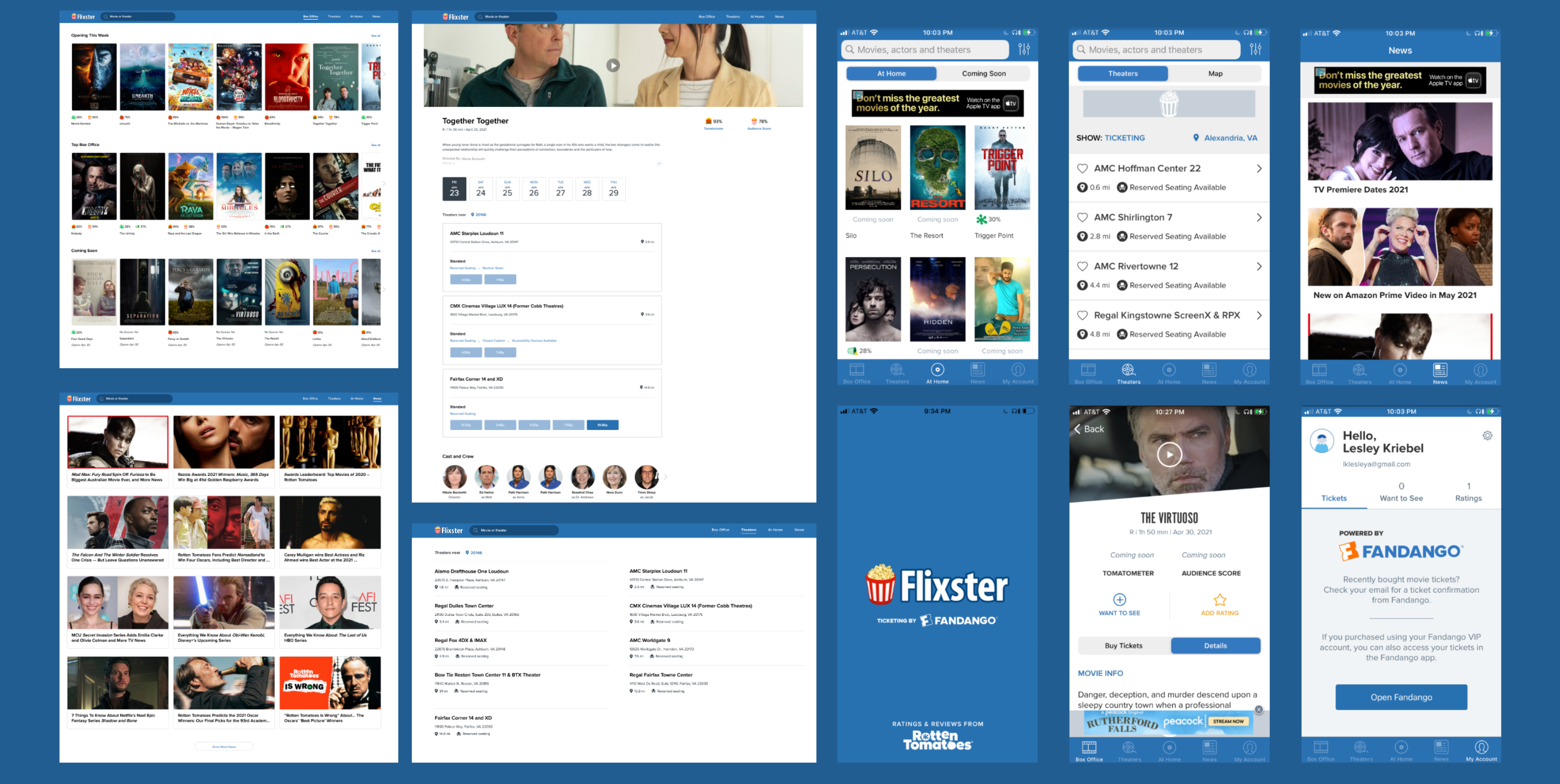
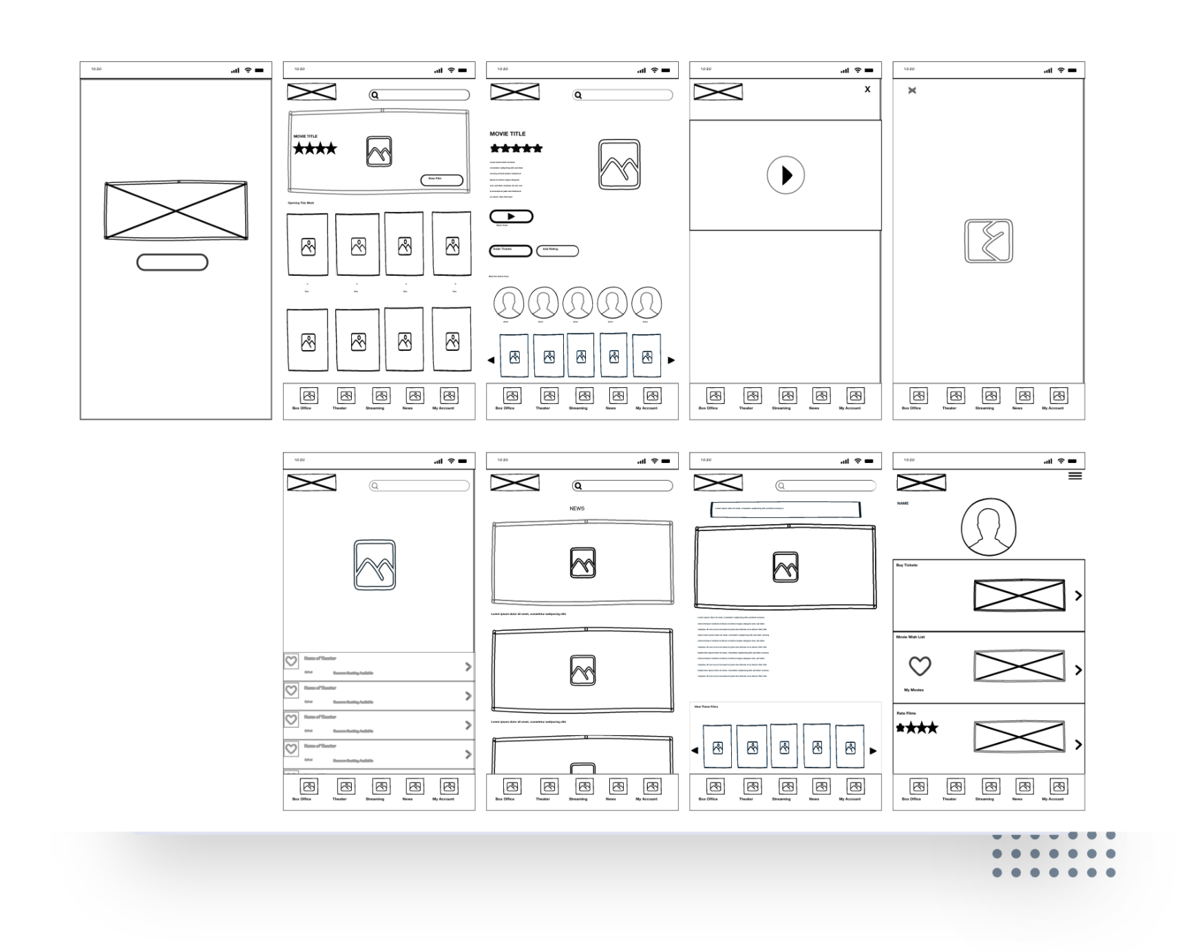
Developing the Wireframes and UI
Wireframes were sketched and created to show the new model for the Flixster app. Sketches were evaluated by team members and additional feedback was given.

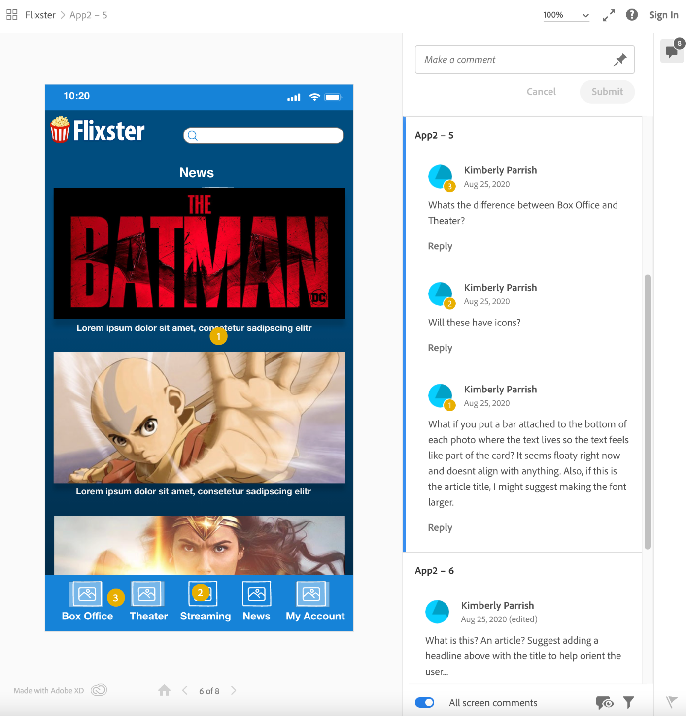
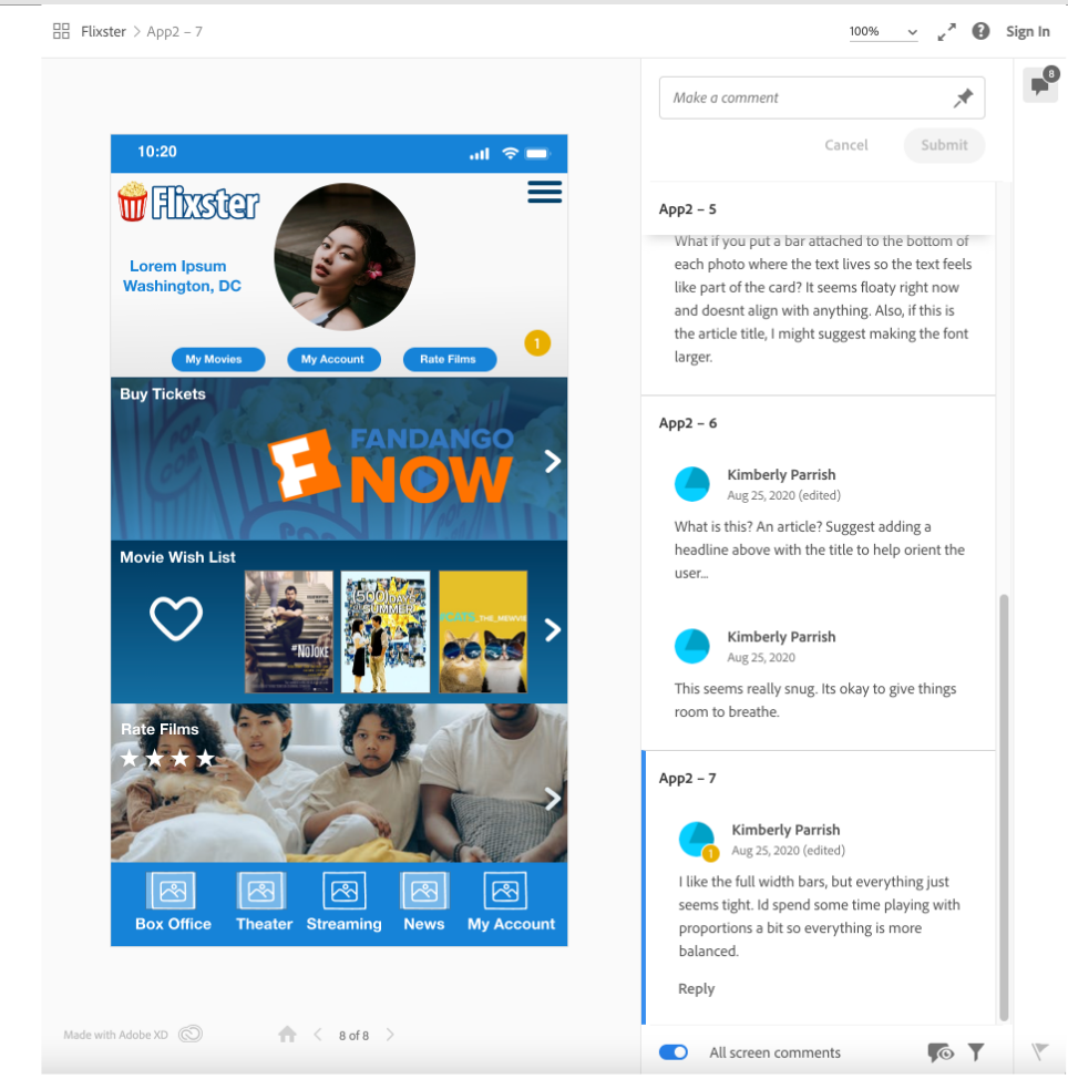
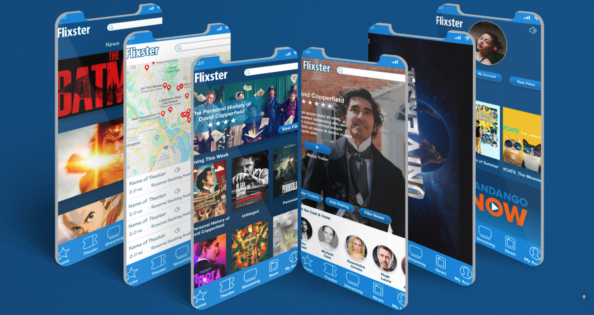
Prototype
Please Click Here to View the High-Fidelity Prototype
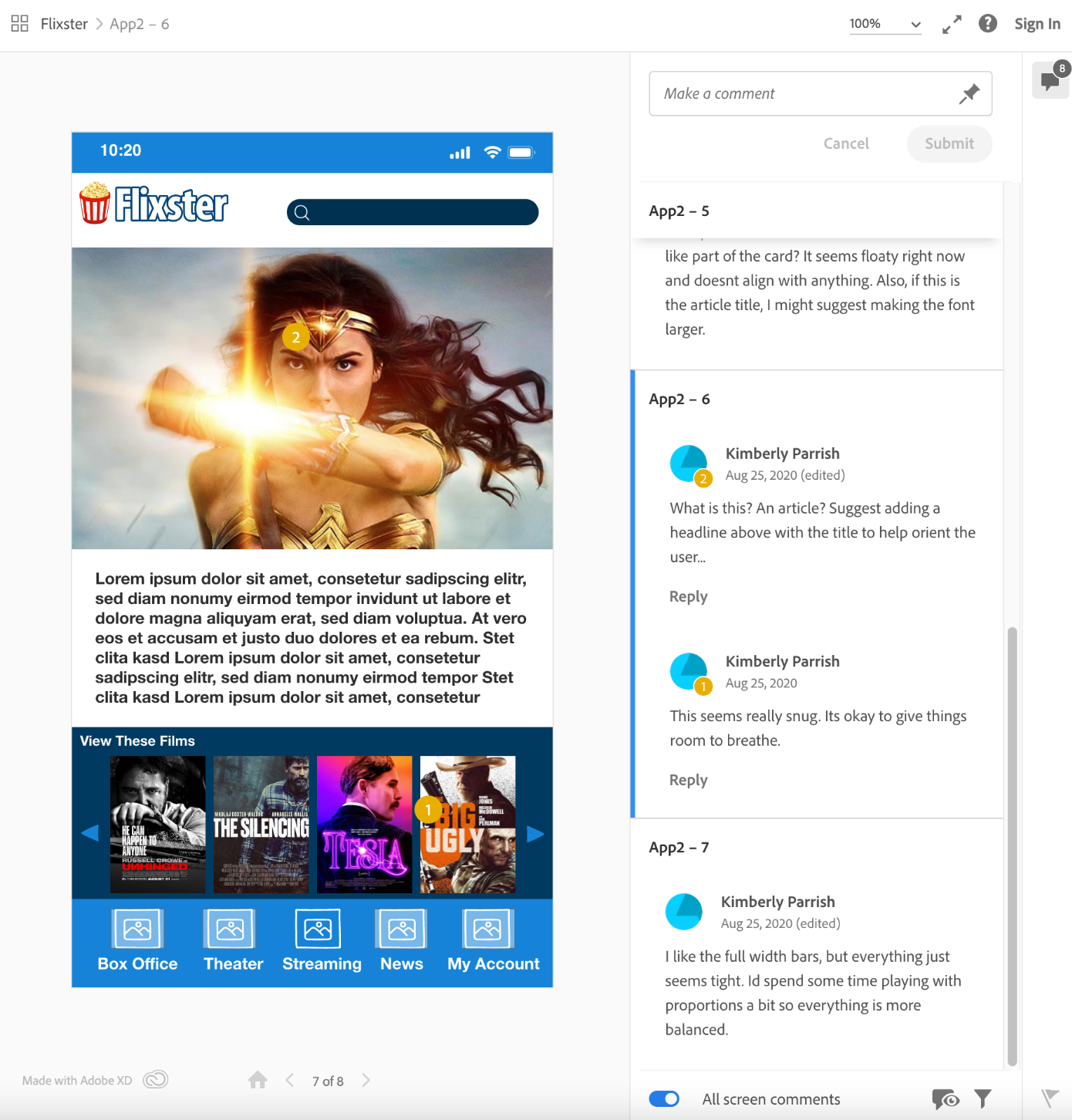
Clickable Prototypes were created to display the actions and animations of the user flow between screens. Overall the feedback was positive and corrections were made as needed. Some corrections in the first prototype included: Adjusting images and fonts for maximum accessibility and creating symmetry in the design for a balanced look and feel in the UI. .
Result
Learnings:
- Adjust font size for readability.
- Have a well-laid-out plan for exits.
- Add headlines to let users know which are images and links to articles.
- Play with portions and keep screens balanced.
- Users respond to recognizable icons.
- Stick to layouts that are similar to what users are familiar with.
- An example would be the Flixster account page.
- The users wanted the provided map to zoom in and out.
Outcomes:
Users quickly associated with familiar icons as long as text was provided. They leaned toward clicking on larger images in the UI and had different perspectives on where you should exit the screens. This is why it’s important to have more than one exit if the design has complex content. The final prototype was produced along with a report of the team’s research and findings. Team members felt that the style and layout stayed true to the Flixster branding and overall like the end product. This project had no affiliation with the company Flixster and was a mock project in recreating a mobile app with a design team using UX research to improve a professional brand.